Druid Data Cookbook: Quantiles in Druid with Data Sketches
Let’s try some fun with data sketches in Apache Druid.
Data sketches are a way to get a good estimate of measures that you would normally only obtain by going through every single row of your data, which could become prohibitive as the amount of data grows.
One common example is counting unique things, such as visitors to a web site. But today I am going to look at quantiles sketches.
According to Wikipedia,
quantiles are cut points dividing the range of a probability distribution into continuous intervals with equal probabilities, or dividing the observations in a sample in the same way.
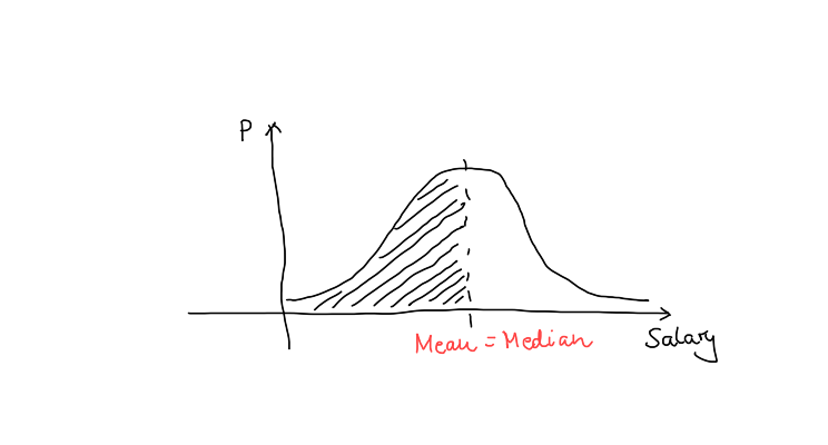
So, the 0.5-quantile of a variable is the cut point such that 50% of rows have a value less than or equal to it, and 50% are above it. The 0.5-quantile is also known as the median. For a standard bell curve, the median and the mean (average) coincide:
Likewise, the cut point such that 25% of values are less than or equal to it, is the first quartile. The median is the second quartile, and so on.
Quantiles are handy when trying to describe properties of distributions that are skewed or have outliers. This is something we are going to look at today.
Generating Data
First, let’s generate some data. I am logging down the incomes of a fictional population that is split into four segments:
- Segment A’s income is normal distributed (bell curve) with the peak at 10,000 and a standard deviation of 2,000.
- Segment B has a normal distribution too, but wider with a standard deviation of 10,000, so we can compare it to Segment C.
- Segment C’s income follows an exponential distribution with a mean of 10,000 (and a standard deviation of 10,000, that’s how the exponential distribution works.)
- Segment D has a bimodal distribution, with the majority of members making around 10,000, and a small group that peaks around 50,000. This is modeled as the weighted sum of two bell curves.
Here’s the code:
import time
import random
import json


def bimodal(m1, m2, s, p):

    if random.random() <= p:
        m = m1
    else:
        m = m2
    return random.gauss(m, s)


def main():

    distr = {
        'A': { 'fn': random.gauss,       'param': (10000, 2000) },
        'B': { 'fn': random.gauss,       'param': (10000, 10000) },
        'C': { 'fn': random.expovariate, 'param': (0.0001,) },
        'D': { 'fn': bimodal,            'param': (10000, 50000, 2000, 0.8) },
    }
    for i in range(0, 10000):
        grp = random.choices('ABCD', cum_weights=(0.50, 0.75, 0.90, 1.00), k=1)[0]
        rec = {
            'tn': time.time() - 10000 + i,
            'cn': grp,
            'rn': distr[grp]['fn'](*distr[grp]['param'])
        }
        print(json.dumps(rec))

if __name__ == "__main__":
    main()
Run this code to generate an input file for Druid, and set up ingestion using the Load data wizard. We are going to roll up the data with a query granularity of 15 minutes, and we want to have three metrics:
- the standard
countmetric - the equally standard sum of salaries
sum_rnso we can actually compute the mean salary for each segment - a quantiles sketch over
rn.
This is configured in the Configure schema section of the wizard like so:
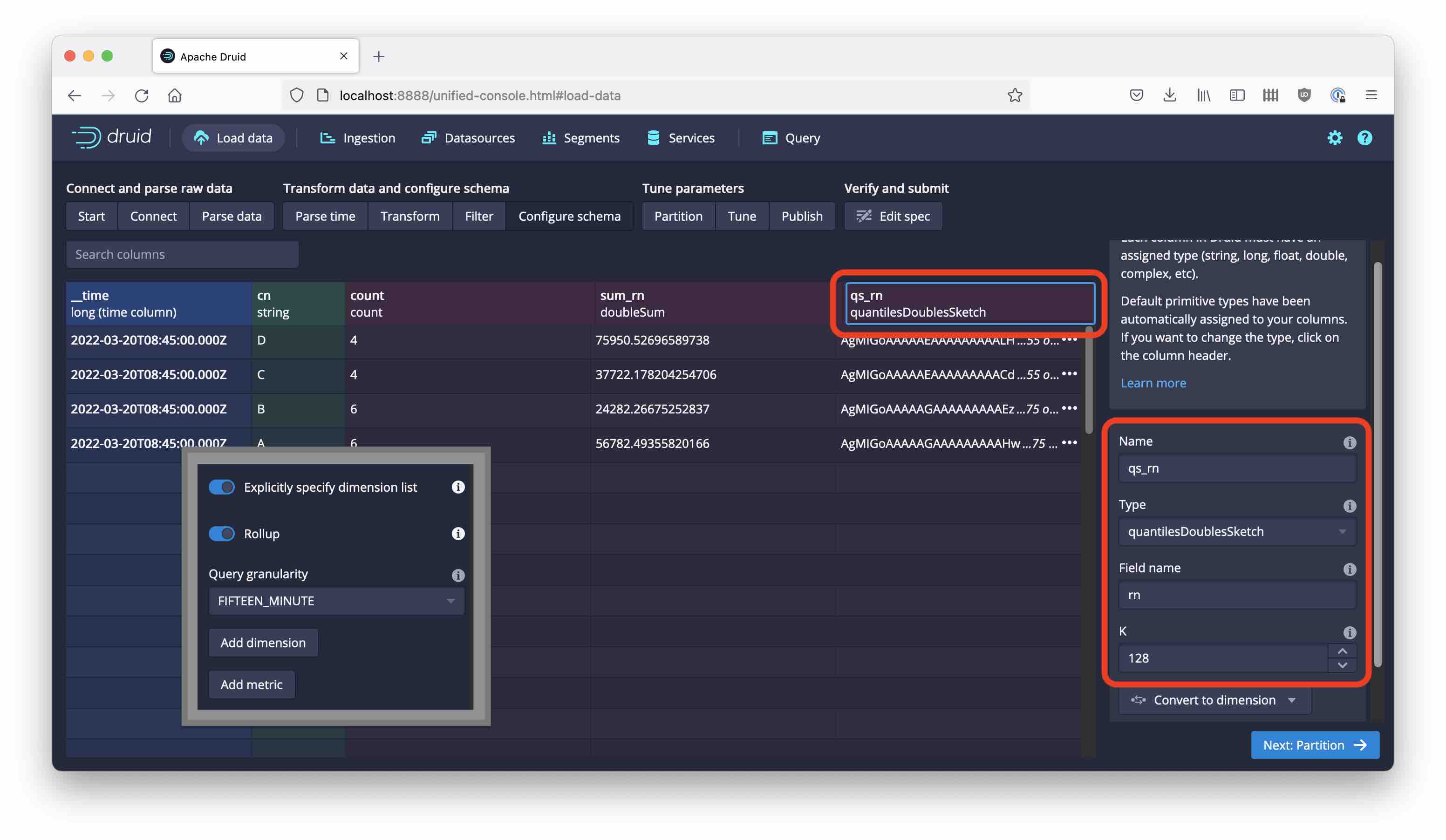
You can set the segment granularity to HOUR.
Getting Quantiles
In order to work with data sketches, you would usually run a GROUP BY query, and run a sketch aggregation over the sketch field. In the case of quantiles sketches, the aggregator is DS_QUANTILES_SKETCH. On top of this, you can run sketch functions that do something useful.
Median vs. Mean
Let’s compute the median income for each population segment:
SELECT
  cn,
  DS_GET_QUANTILE(DS_QUANTILES_SKETCH(qs_rn, 128), 0.5) AS median_s,
  SUM(sum_rn) / SUM("count") AS mean_s
FROM randstream_salary
GROUP BY 1
| cn | median_s | mean_s |
|---|---|---|
| A | 9996.84943938557 | 9989.123516983642 |
| B | 9868.801625916114 | 9856.779147538875 |
| C | 6790.745679257308 | 9771.002219613993 |
| D | 10906.525946085518 | 18933.47273254579 |
(Since these are random numbers, your result will be slightly different.)
As we expected, for segments A and B the median and mean values coincide (more or less.) Segment C, the one with the exponential distribution, has a difference - the mean value is 1 / λ, the parameter of the distribution, while the median is ln(2) / λ, and ln(2) ≃ 0.693 so we’re good.
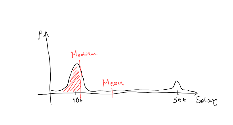
Segment D has the most pronounced discrepancy between mean and median - the median is well within the big first bump of the distribution and reflects what “most” of the population members can expect to earn. The mean shows a distorted picture because of the small subsegment of high earners:
Because the combination DS_GET_QUANTILE(DS_QUANTILES_SKETCH(...)) is so frequently used, you can use the shorthand APPROX_QUANTILE(expr, probability, [resolution]) instead.
Quartiles and More
Let’s beef up this query a bit. We want to know the salary thresholds for 25%, 50%, and 75% of the population of each segment, respectively:
SELECT
  cn,
  DS_GET_QUANTILE(DS_QUANTILES_SKETCH(qs_rn, 128), 0.25) AS q1_s,
  DS_GET_QUANTILE(DS_QUANTILES_SKETCH(qs_rn, 128), 0.5) AS q2_s,
  DS_GET_QUANTILE(DS_QUANTILES_SKETCH(qs_rn, 128), 0.75) AS q3_s,
  SUM(sum_rn) / SUM("count") AS mean_s
FROM randstream_salary
GROUP BY 1
| cn | q1_s | q2_s | q3_s | mean_s |
|---|---|---|---|---|
| A | 8644.233235251919 | 9996.84943938557 | 11393.163108254672 | 9989.123516983642 |
| B | 2965.15230310896 | 9969.383470761108 | 16554.475078454096 | 9856.779147538875 |
| C | 2779.0521582375077 | 6741.121631303921 | 13769.232186289446 | 9771.002219613993 |
| D | 9201.740561816481 | 10831.763371338158 | 13466.267335825763 | 18933.47273254579 |
We can now see the difference between A and B, B being much broader distributed. Also the skewedness of D becomes even clearer - more then 75% of that segment are concentrated within the lower peak!
There’s a nice way to return multiple quantile values from one function call using DS_GET_QUANTILES. This function takes a variable number of relative frequency values and returns the quantiles for all of them in an SQL array:
SELECT
  cn,
  DS_GET_QUANTILES(DS_QUANTILES_SKETCH(qs_rn, 128), 0.25, 0.5, 0.75) AS quartiles_s
FROM randstream_salary
GROUP BY 1
| cn | quartiles_s |
|---|---|
| A | [8644.233235251919,9996.84943938557,11390.835537907638] |
| B | [2957.7551807357313,9898.406577909447,16443.42636844785] |
| C | [2779.0521582375077,6743.422567701859,13769.232186289446] |
| D | [9201.740561816481,10831.763371338158,13475.30741204272] |
Outlier Detection
Finally, quantiles are handy to find boundaries of a value range if we want to exclude outliers. This query:
SELECT
  cn,
  DS_GET_QUANTILE(DS_QUANTILES_SKETCH(qs_rn, 128), 0.98) AS most_s,
  SUM(sum_rn) / SUM("count") AS mean_s
FROM randstream_salary
GROUP BY 1
will give the maximum salary of each segment, excluding extreme outliers.
Going The Other Way Round: Approximating Histograms and Cumulative Distribution Functions
There’s a set of functions that, in a sense, is the reverse of the quantiles functions. Until now we have given the algorithm a relative frequency (such as 0.5) and asked for the value of the random variable that represented the cutoff for that share. What if we ask the other way round:
For a given value of X = x, what share of the population represents a value less than or equal to x?
This brings us to the problem of approximating the cumulative distribution function (CDF). Luckily, Druid has us covered here too!
CDF for a single value
You can get an estimate for a single value of the CDF by calling … DS_RANK on an aggregated quantiles sketch.
Show me the percentage of members in each segment that earn less than $10k:
SELECT
  cn,
  DS_RANK(DS_QUANTILES_SKETCH(qs_rn, 128), 10000) AS f10k_s
FROM randstream_salary
GROUP BY 1
| cn | f10k_s |
|---|---|
| A | 0.5003940110323088 |
| B | 0.5004019292604501 |
| C | 0.6471399035148173 |
| D | 0.3614213197969543 |
No surprises here! Since distributions A and B have a median of 10k, the CDF value should be 0.5 (or close to it), and that’s what we got!
CDF for multiple values
We also have the capability to return estimates of the CDF at multiple points in an array. This function is aptly named DS_CDF:
SELECT
  cn,
  DS_CDF(DS_QUANTILES_SKETCH(qs_rn, 128), 5000, 10000, 20000, 30000) AS ff_s
FROM randstream_salary
GROUP BY 1
| cn | ff_s |
|---|---|
| A | [0.0065011820330969266,0.5003940110323088,1.0,1.0,1.0] |
| B | [0.3046623794212219,0.5004019292604501,0.8384244372990354,0.9682475884244373,1.0] |
| C | [0.39972432804962094,0.6471399035148173,0.8662991040661613,0.9558924879393522,1.0] |
| D | [0.0040609137055837565,0.3614213197969543,0.7756345177664975,0.7756345177664975,1.0] |
Approximate Histograms
Finally, if we want to know how many people are in each of a defined set of buckets, we can use the DS_HISTOGRAM function:
SELECT
  cn,
  DS_HISTOGRAM(DS_QUANTILES_SKETCH(qs_rn, 128), 5000, 10000, 20000, 30000) AS hist_s
FROM randstream_salary
GROUP BY 1
If you give it n cutoff points, it creates n + 1 buckets and estimates the number of records in each:
| cn | hist_s |
|---|---|
| A | [33.0,2507.0,2536.0,0.0,0.0] |
| B | [758.0,486.99999999999994,857.0000000000001,323.0,63.0] |
| C | [580.0,359.0,318.0,130.0,64.0] |
| D | [4.0,352.0,408.0,0.0,221.0] |
Learnings
- Quantiles sketches are a powerful tool for estimating the shape of a distribution of values.
- They can be used to find “representative” or “most typical” values, and to exclude outliers.
- Quantiles and CDF estimators complement each other.
- Each estimator exists in a version that returns a single value, and another one that returns multiple values in an array.
“This image is taken from Page 500 of Praktisches Kochbuch für die gewöhnliche und feinere Küche” by Medical Heritage Library, Inc. is licensed under CC BY-NC-SA 2.0 ![]()
![]()
![]()
![]() .
.